Last weekend, at the 2015 Australian Grand Prix, Formula One Management (FOM) unveiled a new graphics set, which on the whole has been well received by blog readers. Inevitably, comparisons will be made between this set of graphics and previous iterations. But which set is your favourite? Here is a look at each graphics set, along with a poll at the bottom of this post.
I’ve made a conscious decision to leave out any of the graphics set from before 1994, as my knowledge of what happened before then in this area is limited. I also don’t know whether there was a consistent graphics set used for complete years, or whether it was the decision of each of the local hosts. What I do know though, is that from 1994, things became a lot more consistent.
1994 to 2003
Anyone who began watching Formula 1 in the late 1990’s will remember this graphics set fondly. Probably dubbed as the classic graphics set, the World Feed graphics were standardised for the beginning of 1994 and remained in place for a decade.
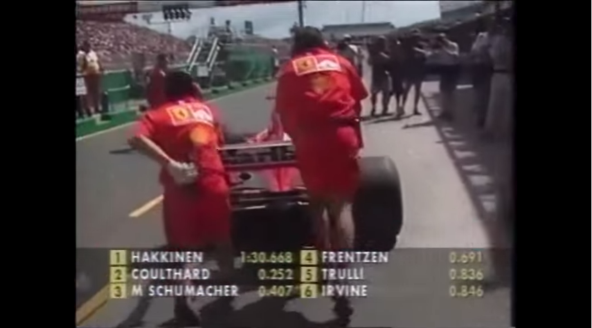
For its time, the graphics did their job perfectly, but towards the end, the graphics set had outlived their welcome as viewers wanted more data and detail, especially those that had returned to the World Feed from the defunct F1 Digital+ platform. Plus, it is fair to say that those graphics would be unsuitable in a widescreen era, and unusable in a three-part qualifying session if not tweaked significantly.
1996 to 2002 – F1 Digital+
Whilst the majority of the world were accustomed to the classic graphics set seen above, a small portion of the audience who subscribed to the F1 Digital+ service across Europe (and in the UK through Sky during 2002) received a different graphics set, which was arguably ahead of its time.

Those who watched via the standard World Feed did see the F1 Digital+ graphics set once, during the 2002 United States Grand Prix, but apart from that, it was hidden away on the pay-per-view service. Once the service collapsed, the graphics were never seen again, although the collapse of the service was what probably led to the World Feed graphics getting an overhaul for the beginning of the 2004 season.
2004 to 2009
The 2004 to 2009 graphics set was notable given the number of new features that came with it, such as the timing tower, which I don’t believe was included in the F1 Digital+ set. This was also the first graphics set that made heavy use of the three lettered abbreviations that are now commonplace in motor sport. What I don’t know is whether these were FOM innovations within motor racing, or a trend that began elsewhere – anyone who watches football will know that abbreviations have been around for decades.

Items such as the rev-counter, which commonly appeared on F1 Digital+, soon became integrated into this graphics set. As with every graphics set, the set was adjusted as time progressed, but the basic template remained the same throughout. As FOM made the transition to widescreen for the 2007 season, the graphics set remained within the 4:3 safe area until they were replaced at the end of 2009. It may not have been the flashiest graphics set ever, however it did its job fine.
2010 to 2014
All of the previous graphics set up until 2010 had featured straight lines, either horizontally or vertically. The graphics set introduced at the 2010 Bahrain Grand Prix went for a more slanted approach, this was presumably done so it matched the slanted aspect of the F1 logo. Yes, the graphics did look ‘sexier’ than previous versions, but did it provide anything that the previous versions did not? Well, not really.

When I compared Dorna’s MotoGP graphics with FOM’s graphics in October 2013, I concluded that “if you are looking for something easy on the eye, then FOM wins, but if you want a data driven set, then Dorna with their MotoGP graphics is a clear winner.” Like the previous version, this set of graphics went through multiple iterations from 2010 until 2014, but the overall vision remained the same, with not much changing under the surface during the course of those five years.
2015
And so, we come to 2015. The year in which FOM have appeared to rip up anything that existed beforehand and start fresh. The inspiration behind the minimalist approach stems from the way design is heading currently, with big brands going down that route. FOM are only following the trend, and I think they have made the right decision. I’m a really big fan of what we saw over the weekend.

Of course, there are always room for improvements with any graphics set, but these are minor tweaks rather than a fundamental flaw in the design. In the poll currently running, 68 percent of you say that you like the new graphics, which is a huge step in the right direction. But, where does the 2015 graphics set stack up for you historically? Do you like the minimalist approach, or do you wish we could travel back in time to the 1990’s and get the ‘black and yellow’ colour scheme back? It is time to have your say in the poll below and as always your views and opinions are welcome.

Being colourblind I am frequently baffled by what’s going on when colour coded graphics are used without any explanation. This needs addressing. Not related to this but the online live timing with its colour coded sectors is just a waste of time for me now
I agree completely with bassbar, especially about loosing sector times.
Forgot to say, the fastest lap time graphic on the new set is virtually unreadable for me. I know it’s supposed to be purple but it blooms and I can’t read it. Very inclusive
yes, I thought that too. Completely pointless with the current colour combination. Needs the background to be lighter so the purple stands out
Adding something to your question about three lettered abbreviations post-2004, I vaguely remember something from the time about copying the three lettered abbreviations of countries at the Olympics. I can’t remember where I read that, but it sprung to mind when I read this article.
Tough one. I love the old yellow box graphics almost for nostalgic reasons. I loved the 2009 season graphics when they polished them up a bit. Always hated the 2010-14 graphics set, although when they had the 7 cars with the time difference was good in 2011. I think the 5 car ticker is to slow. Really like the new graphics set this weekend and the timer to the left.
I think the 2010 graphics looked best visually but I can see why the new ones are more popular for most people. There are however two problems with the new graphics which I hope we’ll see fixed before not too long: firstly the lack of driver numbers is disappointing especially with the recent push to ‘brand’ these. It would be even better if they integrated the official team or driver number designs which sky sports have been using through last year. The second point is that in qualifying the chequered flag no longer comes up when drivers take the flag at the end of each session. This makes it harder to work out who may still leap up the order or take pole and maybe made things a little less clear last Saturday. I’m sure there were a few other things as well, but these are the points that initially spring to mind for me. I must say though that the track map intro which pops up at the start of each session and the fom grid run through look fantastic, but I do wish Sky would bring back their ‘back to front’ guide with driver walk to cameras. I don’t think this has appeared in race build ups since about Singapore last year but still features at the start of their highlights shows!
I do agree with some of the comments I did find the purple ones not very clear if fom could make the graphics a lot clearer it would help ie make them stand more with the drivers number next to his position in the race I use the driver tracker on the f1 app it cost £19 to download but it’s good value for money plus you get better graphics on it aswell also I wish fom would make it easier to identifie the drivers particularly the smaller teams as it can be hard to disquisih the drivers.
I’ve also signed up for the F1 app because I missed the sector times that used to come up before 2014, the use of colours instead was useless to me for I also am part colour blind as are 20% of the male population. The £19 is money well spent, better than subscribing to Sky Sports at £40 per month if you want nothing else on that channel.
The app has so much information for F1petrolheads. It does mean you need to have it on a laptop to get the best out of it, but it adds so much more to the enjoyment of not just the race but also the qualifying.
What I would like to see is a display of the corner name or number for each camera position, so that you know exactly which part of the circuit they are at, with so many circuits looking identical, this is currently very difficult.
While I generally like the changes made in 2015, the biggest issue I’m finding is readability. The semi-transparent background makes much of the text difficult to read depending on the camera shot. For me, the fastest lap graphic was illegible every time it was used. In both cases I believe this is a font issue. The 2010 package had transparency, but the font was nicely bolded.
I’m also disappointed with the lack of national flag and driver number integration. This is something I feel the 2014 graphics did in most cases.
Where I think the 2015 updates make the biggest impact is their integration with the mobile app. This struck me as the most improved aspect of the update. The timing now looks clean, organized and displays the performance data beautifully.
“As FOM made the transition to widescreen for the 2007 season, the graphics set remained within the 4:3 safe area until they were replaced at the end of 2009.”
In 2009 FOM produced both 4:3 and 16:9 world feeds, BBC took the 4:3
You could have included the graphics from late 1991 to 1993 as well… They featured pictures of drivers which was a big move at the time
Oh and I’m not one to brag or anything but I’ve been pretty fortunate to be able to watch the F1 digital plus output from 1998 to 2002 (couldn’t do it in 1997) and the tv direction has got so much worse over the years
I’ve always preferred the 1994-2003 package, probably more to do with nostalgia as I started to watch F1 as they came out. They were a bit rough in 1994 but they improved them greatly for 1995 especially with the car number being in the blue oval.
The 2004-2009 ones were OK, if a bit small, and the biggest bugbear for me was the exclusion of the car number.
I never really took to the 2010-2014 package, think all the slanting aspect of them made them a bit messy, but at least we got the car number back last year.
This years are OKish, but I do feel that with all the technology out there now that if they were going to change them it could’ve been a more radical one – and why have they now took away the car number again!
I’ll always be fond of the 1994-2003 graphics, (I guess because I started watching F1 in this era!) due to their boldness and clarity. However, they were not the most technically perfect.
Technically I think the 2015 graphics are the best, but I feel there are a few improvements — of which I’m sure these have been previously mentioned — that could be made:
1. Driver numbers need including, maybe even a small image of their helmet?
2. Some of the paler transparent elements needed the opacity increasing, as when set against ‘busy’ images they can make the content hard to see.
3. For the lap timer, instead of colouring the type in green, purple or yellow, it should be white, contained in a coloured box. This would be much easier to see on screen, especially in the case of the purple fastest lap graphic we saw in the race.
4. Increase the size of the team’s colour block in the side panel on screen, this would make it clearer to distinguish darker or similar colours such as we see with Red Bull/Toro Rosso.
As a personal note, I’d like the graphics to be a tiny bit bigger, but then again I watch the F1 on a 26″ TV, so I’m sure for most people it’s just right on a bigger TV!
I really like the new set of graphics but as mentioned above the green and purple with transparency is very difficult to read. I found this particularly annoying during qualifying as you could’t see the new fastest time! I also second the call for driver numbers to return. I’m sure these early teething problems will be sorted out.
I think that the evolution of the 2010 graphics set to what it became last year is better than what they have so far with the new set. As mentioned by others above, the coloured text is hard to read (especially the purple) and driver numbers have disappeared for some reason.
Also, they haven’t really improved on what they had last year. Its just the same thing with a more “modern” design. For example, it would have been a perfect time to implement the feature which Dorna has for the Moto GP where in quali they have a little graphic for each driver for the 3 sectors around the track, rather than just a final lap time.
Finally, probably more of a personal preference, but I would prefer the lap counter/quali timer to stand out a bit more from the rest of the design, either by highlighting it in some way or moving it back to the middle of the screen..
So as it stands at the moment I prefer the 2014 set to the current one. Hopefully, FOM will update it throughout the year rather than just wait till next season to implement any changes/updates.
The only issues I have with the updated graphics are:
1. There appears to be two ‘versions’ of drivers in the pits – one with “pits” in red, and one with “pits” in the standard colour. What is the difference?
2. There is no chequered flag to show when the drivers have crossed the line at the end of each quali session.
Admittedly, these might just be temporary issues given we have only had one race weekend with the new graphics, but these will be frustrating for me if not a temporary issue.
I think when a driver comes into the pits it flashes red for about 10 seconds and then goes white. I agree about the chequered flag graphic though!
I hate transparency and I love opaque texts. As said in F1 Technical forum, the rule to be followed here is “simplicity”. 2004-2008 version was my favourite one, and also Australia 2014 (they put all the differencies to the leader -gap- in an 8 group list).
2009 was a bit odd and unreadable, with a bit of transparency. Don’t like it very much.
2010 was fine in Bahrein and Australia, but could have been better if the low side bar was continuously moving sidewards to the left.
My favourite graphic’s order is:
Australia 2014
2008
2006
2007
2005
2004
F1 Digital + (1999-2002)
1992-2003
2010
2009
2012
2013
2014
2011
2015
Forgot to say that it is not nice, for me, to show a driver and then show it again in the next page (low side bar); that problem could be solved if the bar was dynamic as in 2008 and 2009.
Suggestion: pass only one “lap” of the low side bar each time it is showed (like in the 2008 Italian GP) and show varied data (as in the 2008 Australian GP).
Arthur, you seem to be the master-connaisseur of F1-TV. I am consulting FOM. Are you on twitter or linkedin ? Can we connect ? My name is Sacha Gortchakoff. Cheer s
If you are consulting FOM Sacha? Please look at my comment of April 1st 2016 and bring that to the attention of the management, also as I am hard of hearing I use the subtitles all the time but they mask the first three on the pillar times display, which is what my wife looks at not the F! timings on my laptop, therefore I would like to see the subtitles right justified, thus uncovering the top of the pillar, with that and the corners displayed on the bottom right of the screen, the present pillar option is the best graphics set.
I like the 90’s graphics set because it was very legible and dramatic. I really do feel that the way the graphics were then actually had a gravitas that increased the pleasure of the race itself. All the later ones look very timid by comparison.
Of the later ones, I agree that the 2004-9 ones look quite boring but I feel FOM went too far in the other direction in 2010. The slanting boxes made everything look messy and aesthetics were simply for aesthetics’ sake. That’s why I really welcomed the change in 2015. Nice and clean yet sleek. Much more legible.
Further to my April 1st comment, as well as being part colour blind, I’m also hard of hearing, therefore use the on screen text of the commentary, unfortunately this is near the top of the screen and the left hand end partly covers up the time display, if it was just moved over by 5% that would be fine.
Again I would like to see the corner name or number displayed for each camera position, for so many circuits have corners that are similar with no identifying features, unlike Monaco etc.
I’m more concerned with the lack of digital graphics on the bottom of the screen?! So frustrating when we have no clue whatsoever how many seconds apart the drivers are? Melbourne no graphics at all? Occasionally graphics popped up but relying on commentry only. Don’t worry about ” which is the viewers favourite ” fix them!! Lack of ‘ times’ on chinas race affects the viewing experience for avid f1 fans and new fans wouldn’t have a clue what is going on!!
Is F1 in 2017 filmed in 4:3 or 16:9, noticed the graphics seem more stretched?
16:9.
The graphics seemed to be standardized towards the tail end of 1991, with the set containing most of the information seen in the 94-03 version – the main drawbacks before the 94 refinement was that the language was always that of the host country, and the race standings graphic w/timing took up the whole screen.